The fact that human beings can perceive colour has been a huge influence on our development and our cultures. Colour has helped to protect us from danger, and find good things to eat. It has helped us to define who we are in relation to others, as well as what we believe. These days, it is as widely used in marketing and medicine as it always has been in art and fashion. Colour blindness can prove a significant disability.
Thinking about how we respond to colour can be a rich seam to plunder for creative purposes. The artists of the Fauvist movement, such as Matisse, and later Abstract Expressionists such like Mark Rothko, used intense shades of colour to convey and provoke emotion. Both Matisse and Picasso made blue nudes, but look at the images they produced:

Picasso Blue Nude 1902

Matisse Blue Nude 1952
Matisse’s vibrant cutout provokes a very different response to Picasso’s sombre meditation on grief.
Blue is the perfect colour to think about as an example. It is culturally significant in many ways. For example, the pigment lapis lazuli, a vibrant blue, was the most expensive pigment available to Medieval and Renaissance artists, so was reserved for only the most important figures. Thus, the Virgin Mary is always pictured wearing a blue robe. In Medieval England, blue was worn as an amulet to ward off ill-health, probably because of its Marian associations. (This is why brides still wear ‘something blue’.) In contrast, in some cultures, blue is shunned as the token of death, ghosts and bad luck.
We identify blue with calm and peace, and blue light has been used in urban areas with some success to reduce violence. Blue can also be associated with depression – we talk of ‘having the blues’.
Conversely, red is seen as a vivid, energetic colour, associated with lust and sex. We speak of the ‘scarlet woman’ for example. It can also be interpreted as a warning of danger, as in ‘Stop’ signs and traffic lights. Rooms painted red look smaller to our perception, but also warmer and cosier. A blue room looks airy and spacious, but can seem rather cold.
Our emotional response to colour is also of interest. We speak of ‘warm’ and ‘cool’ colours, and choose the clothes we wear by colour according to our mood. I wear bright red all the time, but my mother accuses me of looking ‘too bright’ when I do! My sister has such a visceral response to the colour lilac that it actually makes her nauseous.
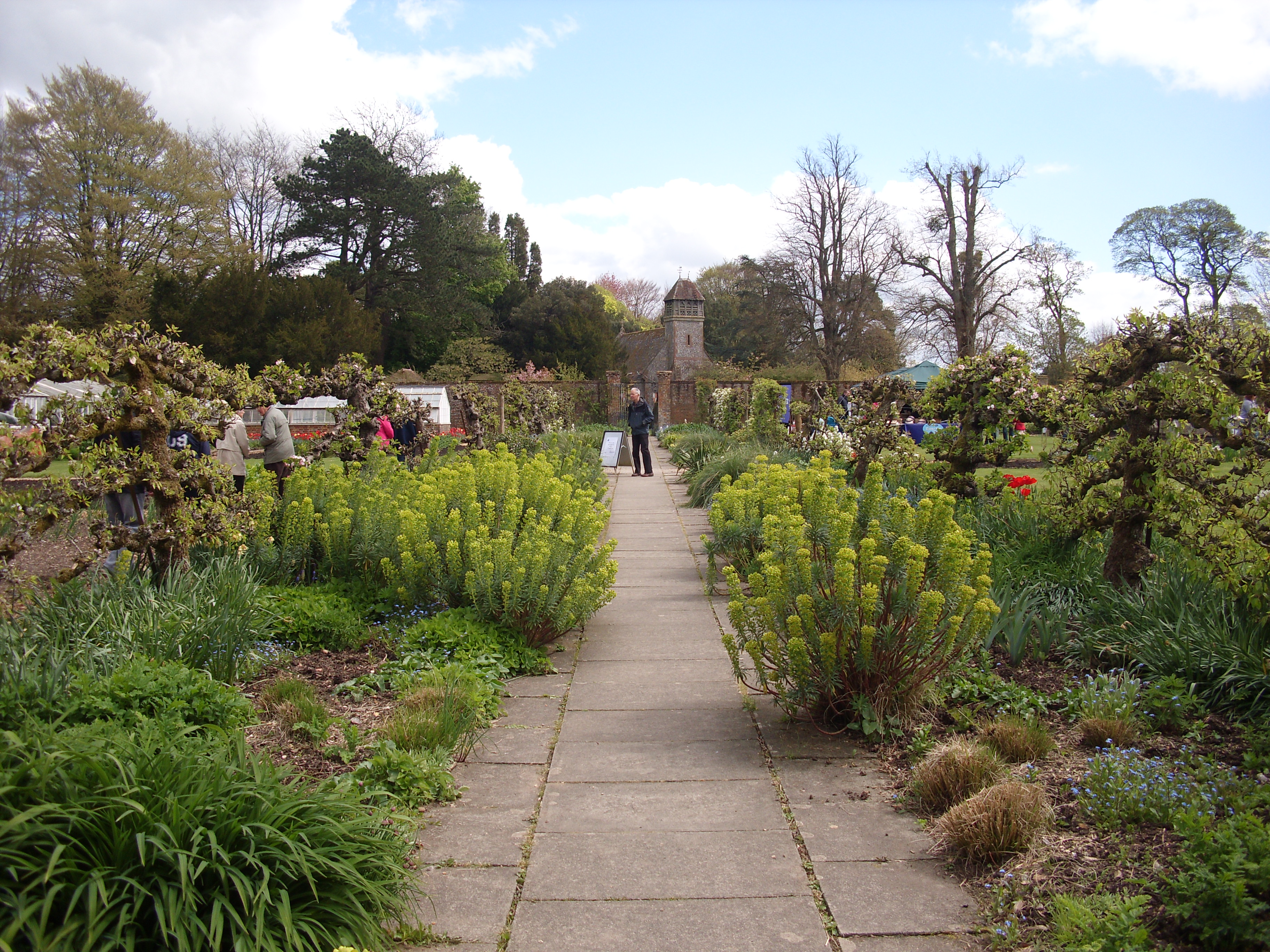
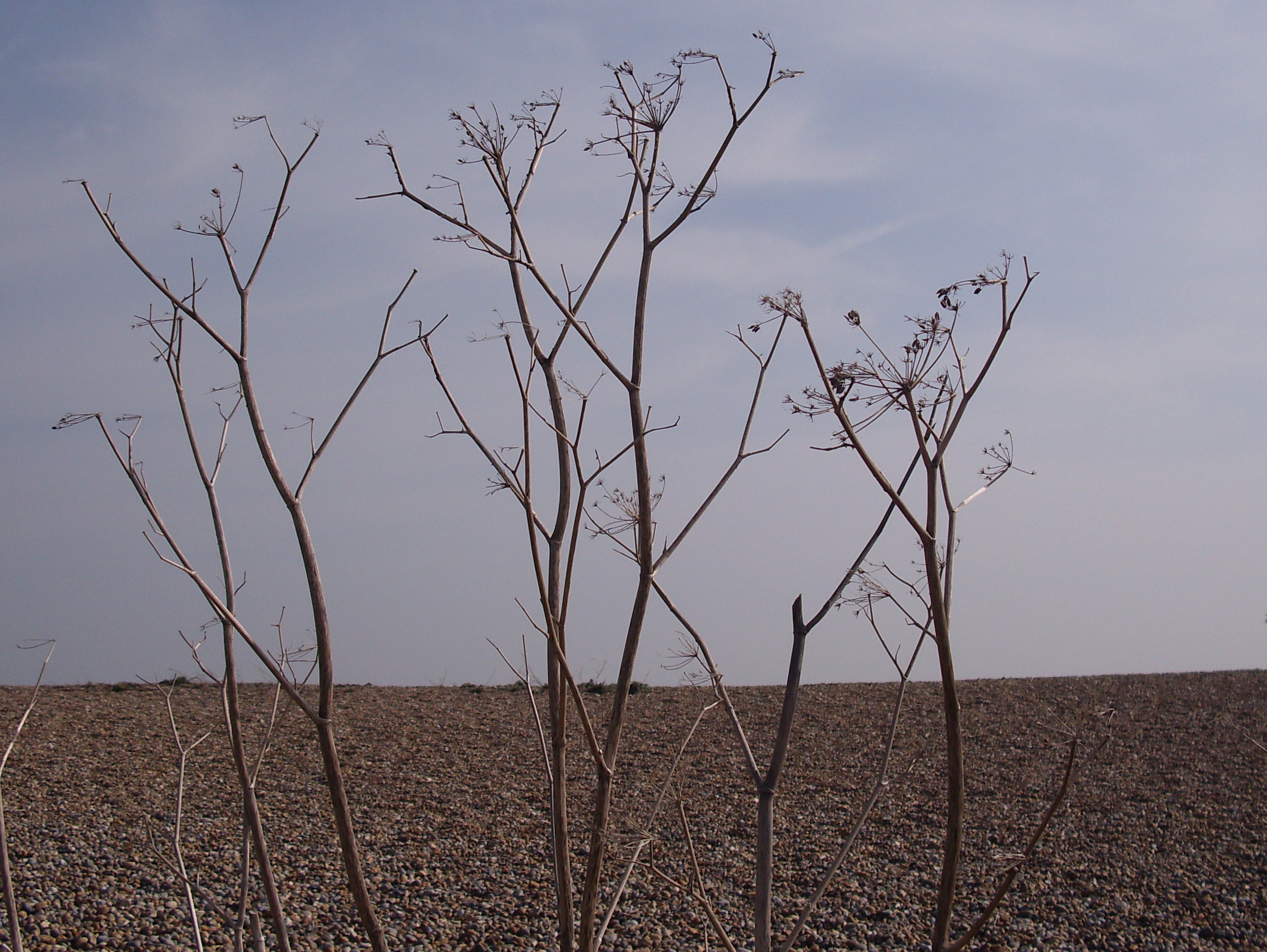
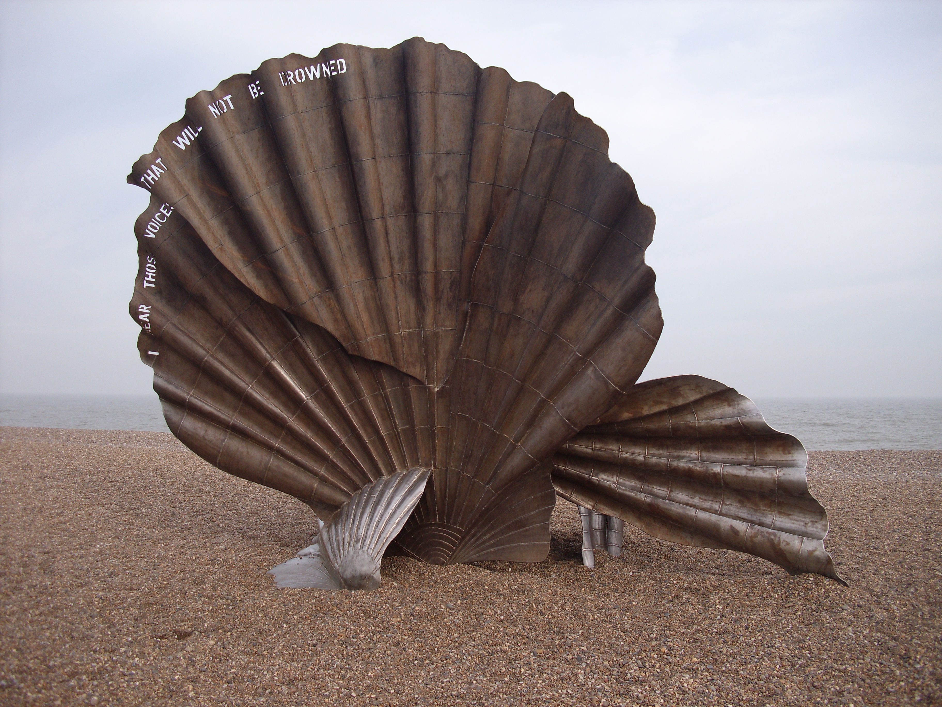
I never really appreciated the importance of colour in the landscape around me until I moved to East Anglia. I grew up on the south coast of England, by the sea. There, the beaches are formed of toffee-coloured flints and broken, bleached shells. The sea is often edged with emerald green seaweed, and is invariably the colour of cold coffee. The crumbling sandy cliffs are the colour of ginger, and are held together by clumps of dark green gorse which turns acid yellow in spring.
The colours of the Norfolk coast are much more muted. The beaches are pale sand, bound with dunes of khaki marram grass. The sea is often indigo or petrol blue, and the skies are milky even in the most brilliant of summer weather. Here, the prevailing colours are buff, dun, woad, grey. They make the south coast seem gaudy by comparison.
As an artist or writer, you can use all this to your advantage. The psychology and culture of colour can set the scenes for your images and stories. Imagine a woman walking into a grey room in a scarlet dress? (Artist Jack Vettriano uses this kind of contrast to huge effect!) Imagine what people would be whispering behind her back. Imagine what the response of the man she is meeting for dinner might be.
Creative Exercises:
Spend some time thinking about your own responses to colour. What colours do you have in your home, and why? Do they remind you of happy memories, or are they just there?
What are the colours you predominently wear? How do you feel in them? Go to the shops and try on garments in colours you would never normally wear. How do they feel? Why would you normally shy away from them? What do you think the colours would say about you if you appeared in public in them?
Spend some time sitting on a bench in the high street, watching passers-by. Note what colours they are wearing. Are you drawn to them because of their colour choices, or repelled? What do you think their colour choices say about them? And what do you think they are trying to say with colour?
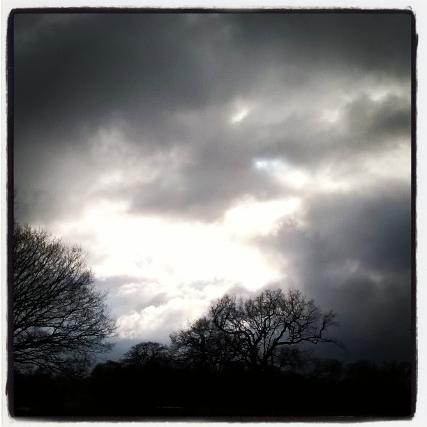
Keep your eyes peeled for colour around you. What colour is your front door, the doctors’ waiting room, the toilet in your favourite restaurant, the plaster of the building across the road? What shades are the trees, the earth, the sky? What do these colours mean to you personally? How do they make you feel?
You might like to spend some time with your writing notebook. Choose a colour and write a word association exercise, scribbling all the words that come into your mind in connection with that colour, no matter how outlandish they might seem. Now go back and examine what you have written. Does your list suggest an atmosphere, a story, an image? Play with whatever comes up as a response and see where it takes you.
There are a host of books you might like to read in connection with this subject. Here are a few:
The Virgin Blue by Tracy Chevalier
The Colour by Rose Tremain
Colour: Travels through the Paintbox by Victoria Finlay
Happy Colouring,
EF